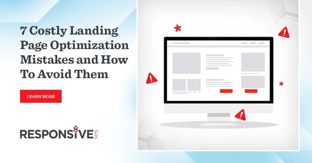
Landing page optimization mistakes can drain your marketing budget faster than a leaky bucket drains water. Moreover, these seemingly small errors often transform promising campaigns into costly disasters, leaving business owners scratching their heads while watching their conversion rates plummet.
Think of your landing page as the front door to your business. However, if that door is confusing, cluttered, or broken, visitors will turn around and walk away before they even step inside. In addition, today’s digital landscape demands perfection users make split-second decisions about whether to stay or leave your page.
Furthermore, the statistics paint a sobering picture: the average landing page conversion rate hovers around 2.35%, while top performers achieve rates of 11.45% or higher. Consequently, the difference between success and failure often lies in avoiding these critical optimization mistakes.
The High Price of Poor Landing Page Design
Before diving into specific mistakes, let’s understand why landing page optimization matters so much. Additionally, consider this: if you’re spending $1,000 on ads to drive 1,000 visitors to a page that converts at 1%, you get 10 customers. However, optimize that same page to convert at 5%, and suddenly you have 50 customers from the same ad spend.
Subsequently, this 5x improvement in performance comes from eliminating common mistakes that sabotage conversion rates. Therefore, every optimization tweak you make can dramatically impact your bottom line.
Mistake #1: Creating Confusing or Weak Headlines
Your headline acts like a movie trailer it needs to grab attention immediately and promise value. Nevertheless, many businesses create headlines that confuse rather than clarify their offer.
For example, instead of writing “Revolutionary Marketing Solutions,” try “Increase Your Sales by 40% in 90 Days with Proven Marketing Strategies.” The second headline specifically tells visitors what they’ll get and when they’ll get it.
Moreover, weak headlines often use industry jargon that makes visitors work too hard to understand the benefit. Remember, if visitors need to think hard about what you’re offering, they’ll simply leave and find a competitor who makes their value proposition crystal clear.
Mistake #2: Overwhelming Visitors with Too Many Choices
Choice paralysis strikes landing pages like quicksand traps unsuspecting travelers. Similarly, when you present visitors with multiple options, call-to-action buttons, or navigation menus, you scatter their attention and reduce conversions.
Furthermore, the human brain struggles with too many decisions. Research shows that people become overwhelmed when presented with more than three options. Consequently, your landing page optimization strategy should focus on one primary action you want visitors to take.
For instance, if you’re selling a course, don’t simultaneously ask visitors to download a free guide, watch a video, and sign up for a newsletter. Instead, focus entirely on getting them to enroll in the course. Additionally, remove navigation menus that might tempt visitors to explore other parts of your website.
Mistake #3: Using Generic, Uninspiring Call-to-Action Buttons
Your call-to-action button is like the finish line in a race it needs to be obvious, attractive, and motivating. However, many businesses use generic phrases like “Submit” or “Click Here” that fail to inspire action.
Moreover, effective CTA buttons tell visitors exactly what happens when they click. For example, instead of “Get Started,” try “Download My Free Marketing Guide” or “Book My Strategy Session Now.” These specific phrases create anticipation and reduce uncertainty.
In addition, button design matters enormously. Use contrasting colors that stand out from your page design, and make buttons large enough to see easily on mobile devices. Furthermore, test different button colors, sometimes changing from blue to orange can increase conversions by 20% or more.
Mistake #4: Ignoring Mobile User Experience
Mobile users now represent over 60% of web traffic, yet many landing pages look terrible on smartphones. Consequently, poor mobile experience destroys conversions and wastes advertising dollars.
Additionally, mobile users behave differently than desktop users. They scan quickly, tap with thumbs, and abandon pages that load slowly. Therefore, your landing page optimization efforts must prioritize mobile-first design.
Furthermore, test your pages on actual devices, not just browser simulators. Check that forms work smoothly, buttons are large enough to tap easily, and text remains readable without zooming. Moreover, ensure your page loads in under three seconds mobile users expect lightning-fast experiences.
Mistake #5: Neglecting Social Proof and Trust Signals
Trust online is like oxygen, invisible but absolutely essential for survival. However, many landing pages fail to include adequate social proof, leaving visitors uncertain about whether to trust the offer.
For example, customer testimonials, case studies, client logos, and security badges all serve as trust signals. Additionally, specific testimonials work better than generic ones. Instead of “Great service!” use “Sarah increased her revenue by $50,000 in six months using this system.”
Moreover, display recent customer counts, ratings, or reviews prominently on your page. Furthermore, if you have industry certifications, awards, or press mentions, showcase these credibility indicators near your main offer.
Mistake #6: Making Forms Too Long and Complex
Forms on landing pages should be like airport security lines as short and painless as possible. Nevertheless, many businesses create forms that ask for unnecessary information, causing visitors to abandon the page.
Additionally, each form field you add reduces your conversion rate. Research indicates that reducing form fields from four to three can increase conversions by 25%. Consequently, only ask for information you absolutely need to deliver your product or service.
Furthermore, consider using multi-step forms for complex offers. Instead of presenting one intimidating form with 15 fields, break it into three steps with five fields each. This approach feels less overwhelming and improves completion rates.
Mistake #7: Failing to Test and Optimize Continuously
Landing page optimization is not a one-time task but an ongoing process, like tending a garden that needs constant attention. However, many businesses set up their pages and forget about them, missing opportunities for significant improvements.
Moreover, what works for one audience might not work for another. Additionally, customer preferences change over time, and new competitors enter the market. Therefore, regular testing helps you stay ahead of these changes.
Furthermore, A/B testing different elements systematically can reveal surprising insights. For instance, changing your headline might increase conversions by 15%, while adjusting your button color might add another 10%. These improvements compound over time, creating substantial business growth.
The Path Forward: Implementing Smart Optimization Strategies
Now that you understand these costly mistakes, let’s focus on implementation. Start by auditing your current landing pages against each mistake we’ve discussed. Additionally, prioritize fixes based on potential impact headline improvements often provide the biggest conversion boosts.
Moreover, implement changes gradually and measure results carefully. Furthermore, document what works and what doesn’t, building a playbook for future landing page optimization projects.
Remember, successful optimization requires patience and persistence. However, businesses that commit to systematic improvement often see conversion rates double or triple within six months.
Traffic doesn’t matter if no one converts. Fix the 7 biggest landing page mistakes by connecting with our team today.
Frequently Asked Questions
Test continuously, but focus on one element at a time. Additionally, run tests for at least two weeks to gather statistically significant data.
Start with your headline and value proposition. Moreover, these elements have the biggest impact on whether visitors stay or leave immediately.
Compare your conversion rate to industry benchmarks. Furthermore, track metrics like bounce rate, time on page, and cost per conversion.
No, create specific pages for different traffic sources. Additionally, tailor messaging to match visitor expectations from each channel.
Length depends on your offer complexity. However, include enough information to convince visitors to take action, whether that requires 500 words or 2,000 words.